‘In the large Gallery space
Alone you notice
The artworks are starting to dissolve’
Had I read a wall label like this at a different point in my life, at a moment at which I wasn’t quite so tethered, perhaps I too would have begun to dissolve. As it is, I experience a second or two of something like labyrinthitis, a tipping from the face of the Earth. I am alone in the large gallery space.
The work of David Steans often does this. It presents a world displaced by just a single sidestep from the one we inhabit, where surreal internal logic and startling detail provoke a kind of migrainous slippage. The magic then is how this newly dislocated way of seeing is channelled back towards our own world, allowing us to observe with fresh eyes the absurdity of structures we navigate in the day to day.
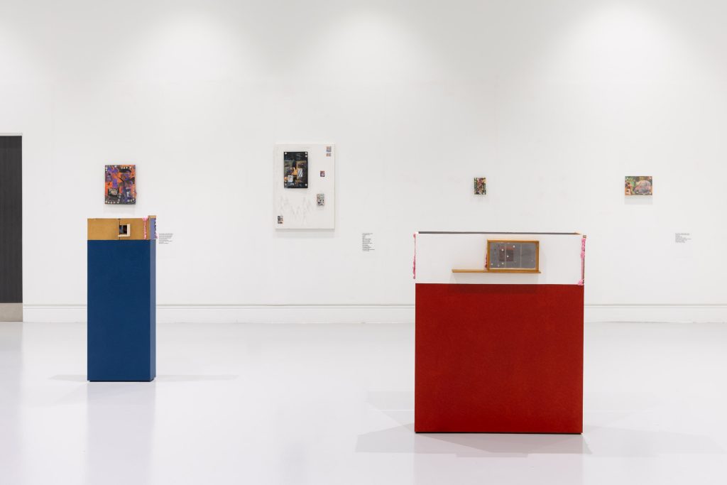
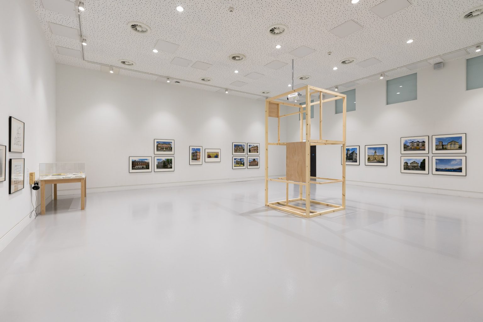
Paperhouse is on show at Blenheim Walk Gallery, Leeds Arts University, an institution where Steans works as a Senior Lecturer. It represents one of the artist’s largest presentations of work to date, and all the works included have been produced this year. There are three main elements: a number of collage works of different sizes, mounted in diverse ways across all four walls; four intriguing models of varying dimensions on plinths in the centre of the room; a series of short, strange wall texts like the one reproduced above, located in places you might expect information labels though clearly doing a very different job of orientation. The collages form the basis of the exhibition materially speaking, but it is the models and the texts which work across and through these to breathe life into the whole, to draw out the ambition.
‘In the large Gallery space
Colourful artworks
colour of autumn leaves
colour of corroded metals
of chemical burn’
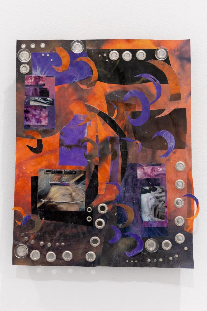
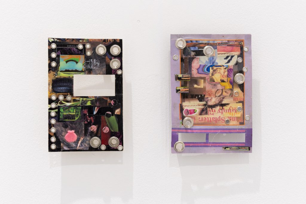
The collages are compelling, ranging from small, polished, jewel-like things to larger, yet equally poised compositions making use of found supports like tabletops or noticeboards. Much of the source material appears to be pages from glossy magazines or similar, seemingly collected for their saturated, vibrant colours as much as anything else (though some of the subject matter, from repeated use, does read through in places – most clearly the various anatomical illustrations of insects, plants, dogs, humans). Rich creams, deep purples, fiery oranges, forest greens, blood reds are organised in different combinations, though with overlapping palettes that mean there is a pleasing consistency of tone throughout.
Each collage is individually resolved – strikingly so, for a supposedly provisional, fundamentally experimental medium – but they also seek to answer each other across space: some paired or grouped, some titled in series, all with intersecting formal and material strategies. ‘RED PUPA’ and ‘GREEN PUPA’ use lockable, glass-fronted noticeboards as supports, sparsely but carefully decorated inside with embroidered patches, laminated collage material, clusters of pins and staples. The precise arrangement and attention to negative space make these feel like mini installations in themselves. Elsewhere, densely layered, claw-like slips of crescents can be found across ‘V Moon’, ‘B Moon’ and ‘P Moon’. The metal eyelets that break the surface of these works, plus the acrylic standoffs used to mount them away from the wall, can also be found across many other pieces – ‘Unique Artistry’, ‘Pup’, ‘Segmentation Research’, ‘Hippy Baggage’ – as can the varnish-like finish of acrylic medium that sometimes makes them read like stretched, fleshy hides.
On three of the four walls there are clusters of the small, jewel-like collages; no more than a dozen in each cluster, each one a small, portrait-oriented rectangle no more than a few inches tall. These are built up in such a precise, rectilinear way they almost look like circuit boards, the acrylic medium glinting like conductive glue paste. Again, as with ‘RED PUPA’ and ‘GREEN PUPA’, these clusters feel like exactingly arranged mini presentations nested within the larger exhibition. And I sense a similar intention with one of the larger works, ‘PROP’. Pasted to an old tabletop, three black pages show hints of gothic text, imperfectly cut away. Two pages retain interlocking, white-framed panels; the other, more orderly frames in red. On the first two, whatever the frames held previously have been collaged over with cut-up anatomical drawings of a human figure posed carrying out various exercises, engaged musculature exposed beneath the figure’s skin. The red frames of the third page have been filled with tiny collage works similar to the clusters elsewhere. Suddenly, these three careful compositions seem to be studies in display-making – panels such as you might find in graphic novels transiting some way towards densely-packed gallery walls within the white expanse of the tabletop.
‘In the large Gallery space
at the centre of the exhibition stands
a smaller large Gallery space
Smaller large Gallery Space
assumes the dimensions of its parent’
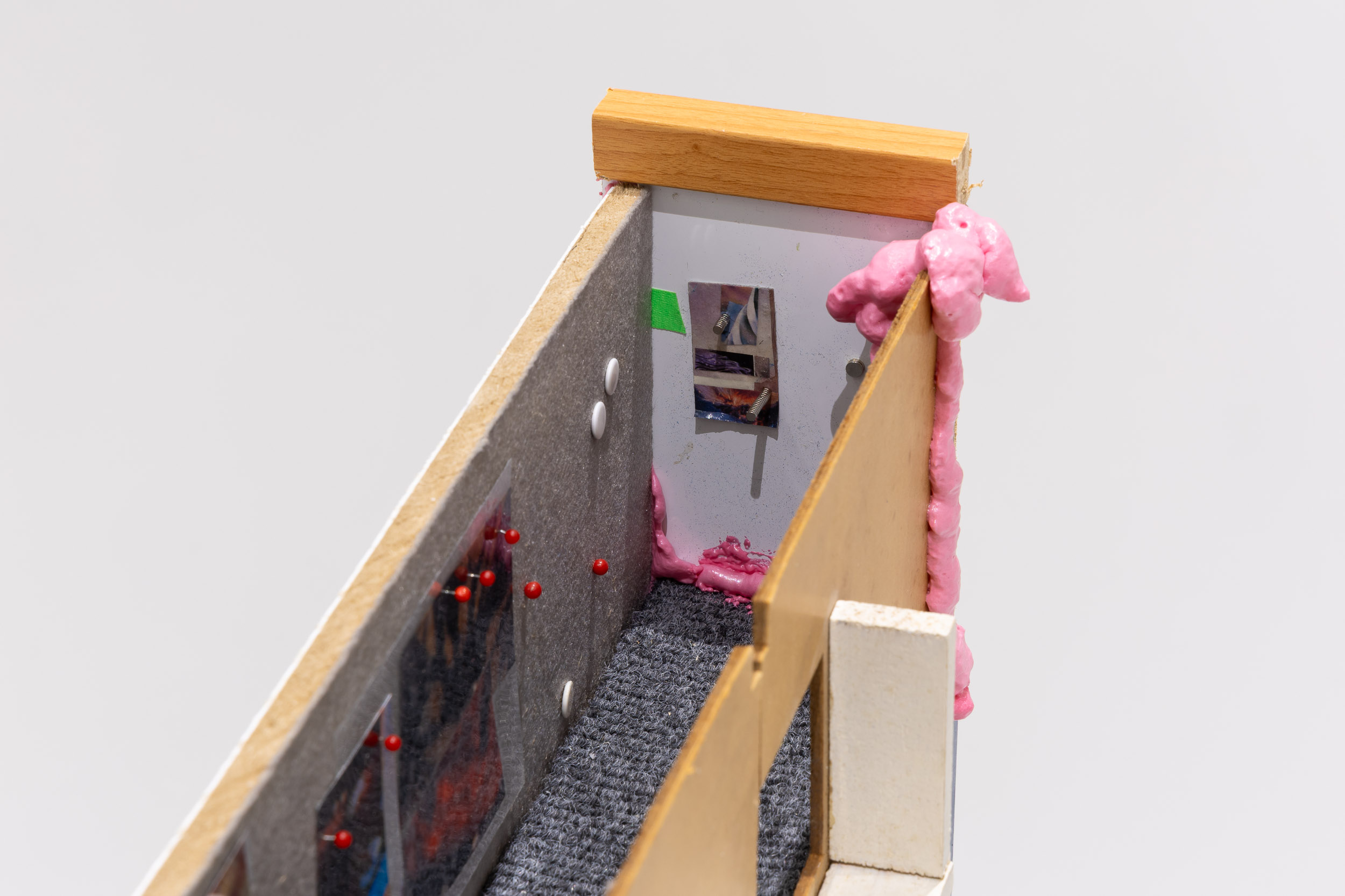
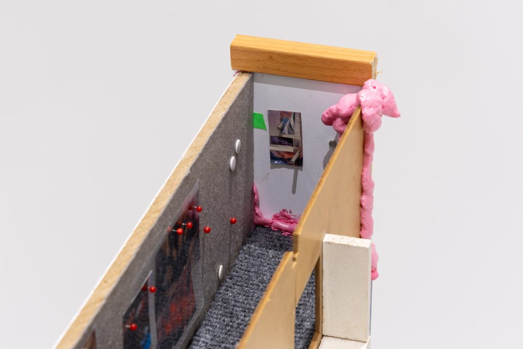
I see exhibitions within exhibitions everywhere I look. Perhaps I am inventing them? The intentionality of the models in the centre of the room can’t be questioned, however. These are raised to varying heights on HDF plinths with the exact same footprint of the models themselves. One plinth is coloured blue, another red, the other two yellow. This is significant. The two models on the yellow plinths are roughly square, one larger than the other. The other two are longer, narrower. All four are like architects’ models, roofless representations of interior spaces. They appear to be made of odds and ends, detritus from the studio – sections of doll’s house wall; drawers and frames, stripped and sutured; scraps of ply, HDF, particle board; a carved-up whiteboard with black scrawls still visible.
It becomes apparent that the two square models represent the gallery space. The scaled-down dimensions seem about right, and the red, blue and yellow coloured blocks plot the plinths’ positions with accuracy. The wall labels at the edges of the room confirm this reading – ‘In the large Gallery space / at the centre of the exhibition stands / a smaller large Gallery space’ – but here again are significant, disquieting slippages. For example, not all the plinths are represented in either model. Also, both models contain only a single tiny representation of a wall-mounted piece, resembling the collage titled ‘Unique Artistry’. It is located in just the right place in each, but why choose to represent only one such work? And what to make of the pink expanding foam oozing from the joins, creeping onto the floors of the model galleries, part adhesive, part unsettling growth?
These questions draw closer attention to other points of difference. There are holes left in (or cut into) the walls of the smaller gallery spaces. Some make clear sense (for example, the door of a section of dolls’ house sits roughly in the position of the main entrance of the ‘real’ gallery) but others not so much (both models have half a wall missing, the same wall, which refers to nothing so obvious). Most intriguingly, both miniature galleries have a single high window roughly three-quarters along one wall. This must refer to one of the four strange, high, square windows that look intrusively over the gallery space at Blenheim Walk. I have always been fascinated by these. Their height above the gallery floor makes them appear like they belong to some sort of observation area – which would make the gallery a test site and us the unwitting participants in some kind of study, I suppose. I’ve often thought it would not be totally unexpected (though still terrifying) to glance up and see a figure in a white coat holding a clipboard. On my visit, the blinds are drawn on all but the third window, three-quarters of the way down the wall, which must surely be a subtle but deliberate intervention on the part of the artist.
Following the logic of the square models, the single apertures three quarters of the way down the lengths of the two slender models must also refer to the same window. Are these therefore intended as a peek into that mysterious upstairs space beyond? The handout offers some clues, as well as providing a possible explanation for what the room might be used for. The models are titled ‘BW Curator’s Office @ 1:12’ and ‘BW Curator’s Office @ 1:24’. Their bottoms are lined with ridged, utilitarian strips of carpet. Again, the sinister pink foam creeps in around the edges. Slips of collage material adorn the walls, along with magnets and pins. Are these analogues for out-of-sight works in the mysterious room above? Close inspection of the floorplan suggests that there is at least one work hidden from view – ‘Spellbreaker’, described as a plushie doll made from scrap fabric and bells – marked in an unreachable place just on the other side of the wall.
‘Starburst pockmarks
abraded with frills
studded with metal and plastic
Glyphs and letterforms
for you to decrypt’
The texts and paratexts are a slippery guide. The loose narrative of the wall vinyls leads the viewer around the room but also pries it open at its seams. The titles of the works offer some clues, but these too seem to have tentacles that reach out beyond – the ‘Moon’ series might refer to a recent work commissioned by Yorkshire Contemporary, ‘Poorly Moon’ (2026); ‘Hippy Baggage’ shares a title with a text and limited-edition zine produced earlier this year; ‘Pup’ might relate to ‘Puppy the Goblin’, a film work screened at Tate Britain in 2022, and ‘Gore Portal variant’ to a piece of erotic fanfiction written by Steans for a special Deftones-themed issue of Vice Magazine in 2025. The title Paperhouse is itself borrowed from Bernard Rose’s 1988 British fantasy-horror film of the same name, in which 11-year-old Anna, ill with glandular fever, draws a house that she later visits in a dream. Subsequent additions to her drawings appear in subsequent dreams, including a boy called Marc who suffers from muscular dystrophy. Anna becomes close to Marc, and then further and further entangled in the spaces and landscapes she has seemingly created from nothing, but which remain linked in strange and inexplicable ways to the waking world.
It might be said that a similarly feverish logic has helped construct Steans’ Paperhouse, but I think it might more accurately be described as a confident looseness. The DIY aesthetic of the collages carries through to the ad-hoc construction of the models. There is a relaxedness in the grammar of the wall texts, inconsistencies of capitalisation, a breathless lack of punctuation. And this looseness serves to camouflage a highly deceptive level of control. This is the real skill of work like this: the untidy edges draw the viewer in, absorb them in a game of detection. If things were neatened up, pinned down, more obviously governed by the controlling hand of the artist, they could conceivably present an ungiving surface off which a viewer’s attention might deflect. As it is, the highly sophisticated blend of medial and literary strategies – reflexivity, repetition, displacement and juxtaposition – steeps into you gradually.
Paperhouse represents, in part, a wrangling of the generative excess of the studio, of material overflow, into the conditions of an exhibition – and also of a practice pulled in multiple directions into the very specific confines of this unusual space at the heart of Steans’ place of work. Although I’ve seen artists make use of Blenheim Walk Gallery and bend it to their will in original and exciting ways (Katrina Cowling, The School of Mutants, Sheila Gaffney), I have yet to see one wear its skin in this unnerving, metatextual way. It is almost parasitical, the works speckled across the white space like mould spores as if they might have grown there (as, in a sense, they have). At first glance, Paperhouse looks like one sort of exhibition, but blink and it becomes another entirely. And then another. Suddenly there is the sense that if you were to lean on the wrong wall, you might tumble out of it completely.
‘You pick yourself up off the floor
You can barely stand
Take a scalpel
and slice your way out’
Benjamin Barra is a writer, editor and curator based in Leeds.
David Steans: Paperhouse is on at Blenheim Walk Gallery, Leeds Arts University, 24 September 2026 – 23 January 2027.
This review is supported by Leeds Arts University.
Published 03.11.2026 by Lesley Guy in Reviews
2,062 words