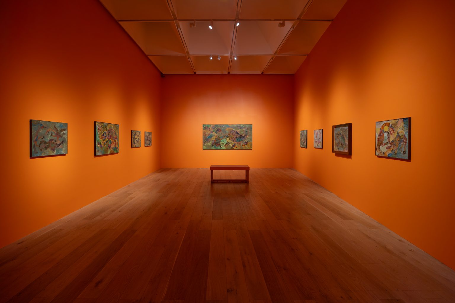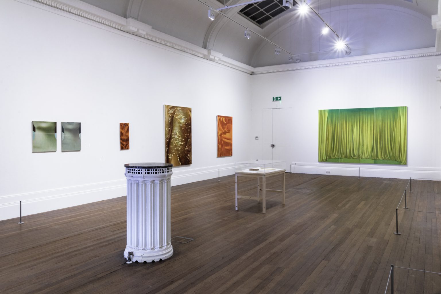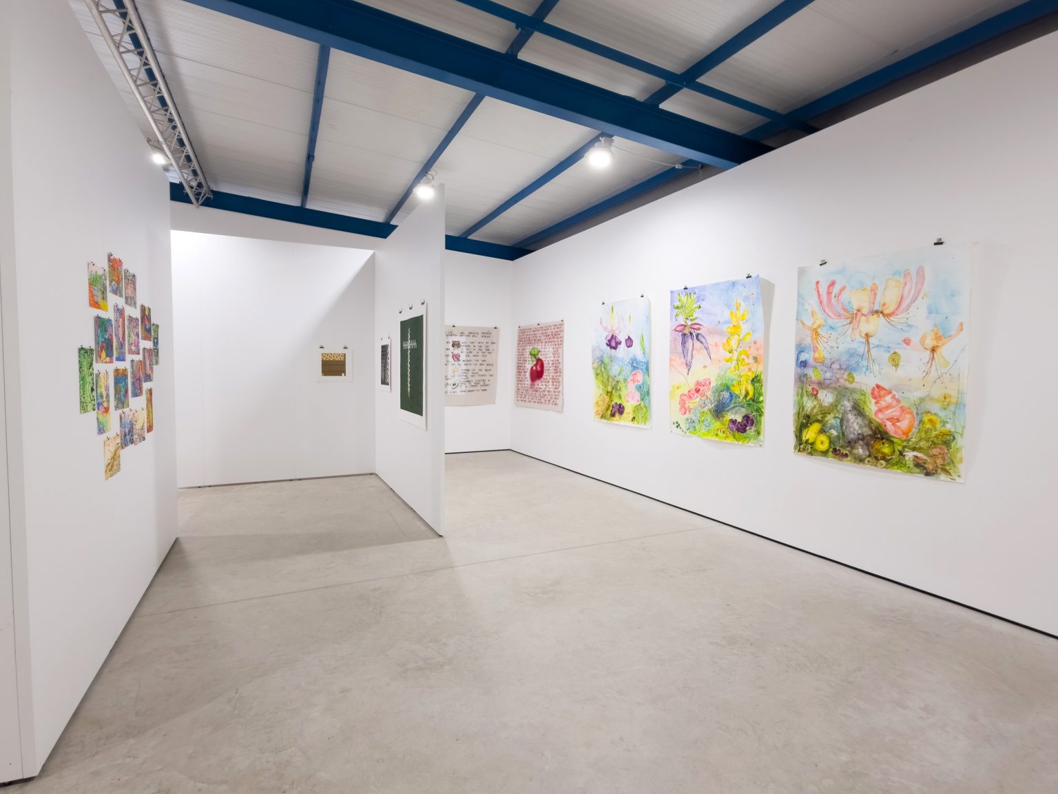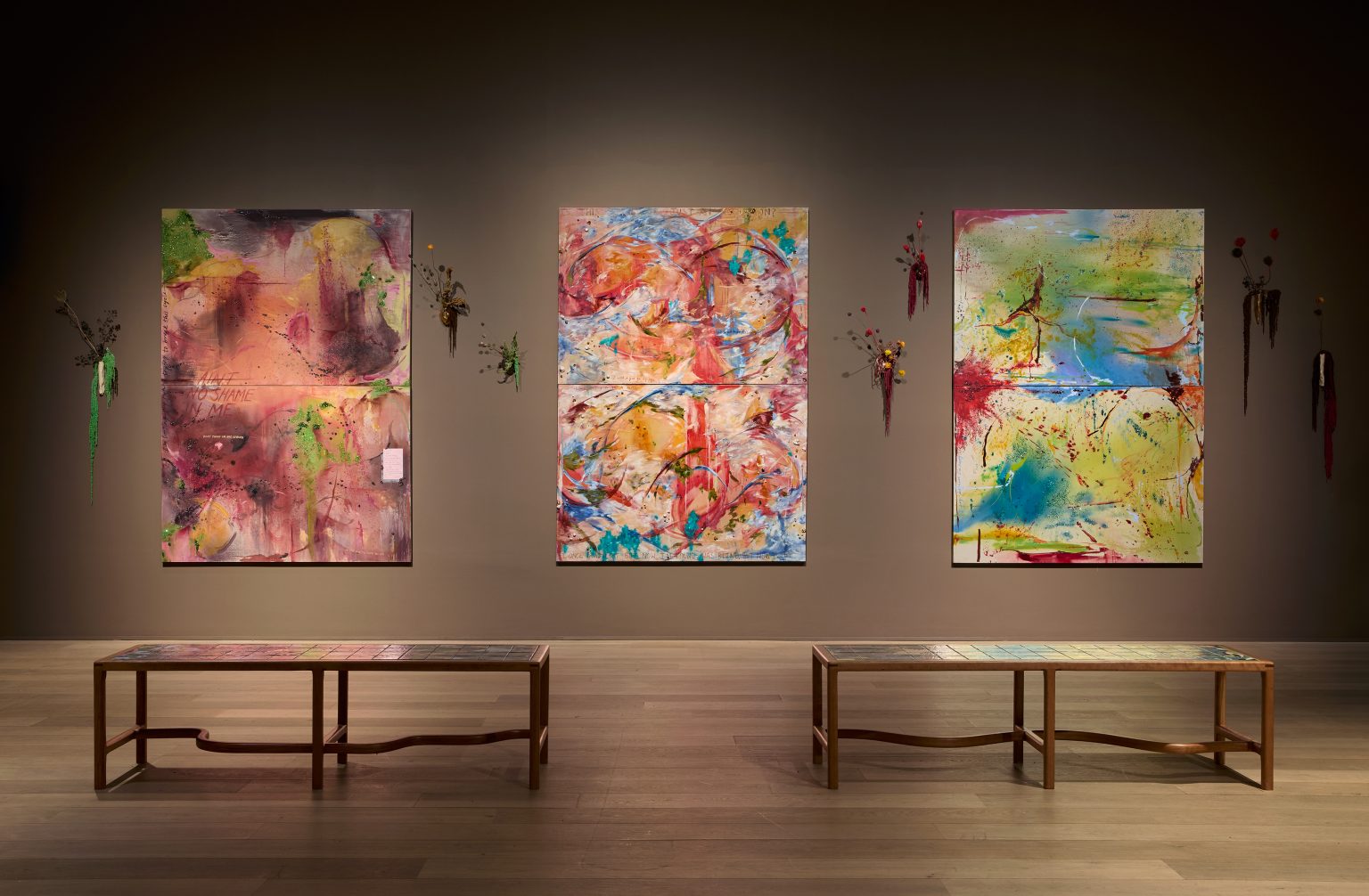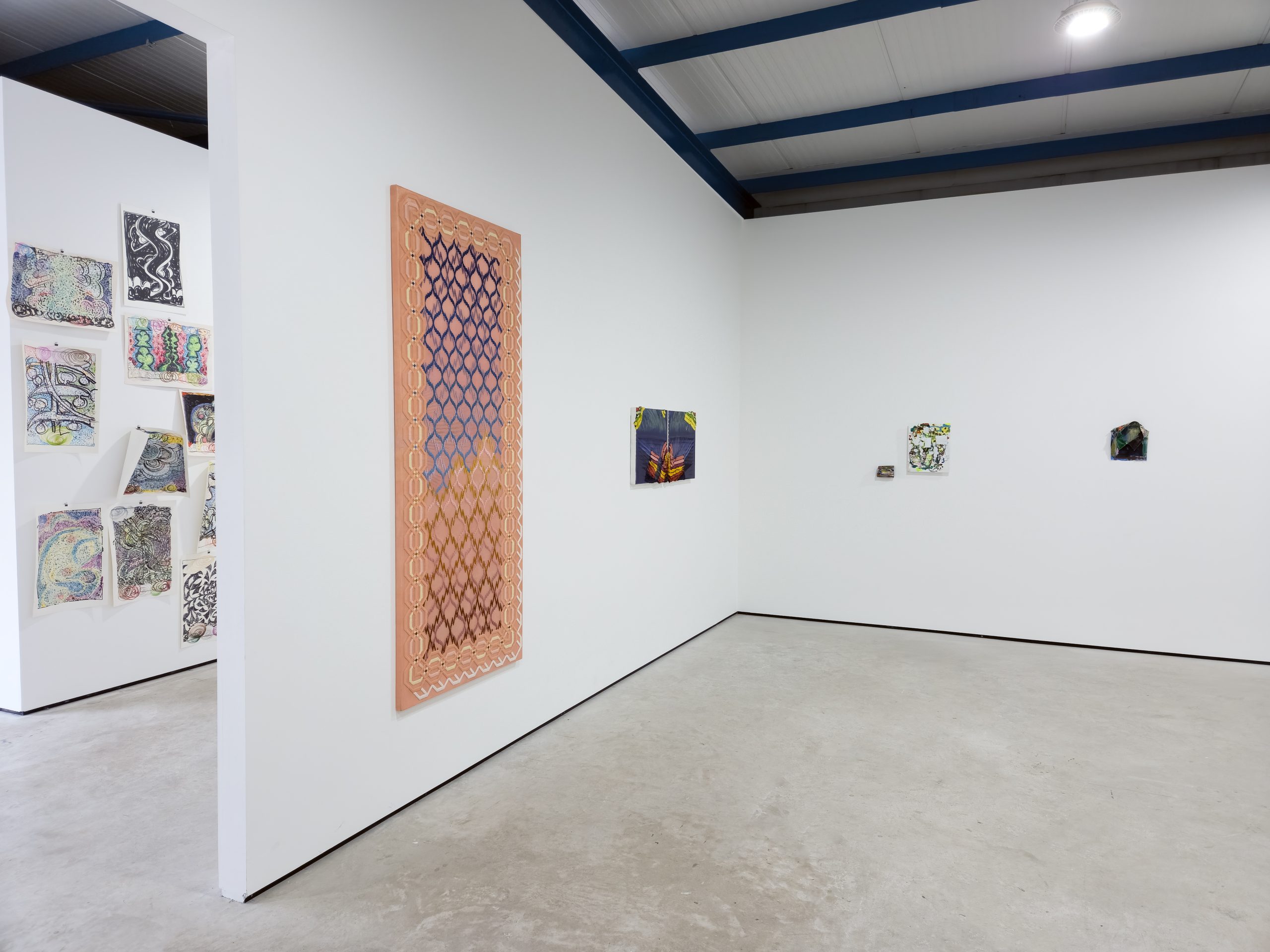
What is a painting? Why does painting continue to obsess us? Conceived by artist and curator Daniel Sturgis, On the Thick and Thin of Painting approaches these questions through twenty-two works by nine artists at Cross Lane Projects. The artworks are presented in dialogue with one another, each challenging the viewer’s assumptions about what a painting is allowed to be. There are canvases here, but also woven cloth, glazed clay, painted marble, aluminium, found clothing, works on paper and gelatin silver prints.
The conversations between works are direct but open to interpretation, and there is something joyful in circulating the gallery and making connections. Tom Benson’s pinned aluminium panels answer Sturgis’s painted grids across the room; the organic coral-like edges of Phillip Allen’s boards rhyme with the buckled planes of Martina Geccelli’s ceramics; Alexis Harding’s wrinkled skins and Cecilia Charlton’s woven fields turn out to be asking the same question about how a surface comes to exist. It feels like a Platonic ideal of a party full of good chats, where everyone is on the same wavelength if not the same page. Sturgis has invited artists he knows, and the intimacy shows. What unites these very different practices is not a shared style but a shared willingness to dismantle painting and rebuild it. Grids, gesture, layering, structure and material all become variables to be tested, with each artist asking a different question about what a painting can be.
Sturgis’s own three ‘Realism (Adorned)’ paintings (2023) are enigmatic and reward closer inspection. From a distance their interlocking lines suggest printed diagrams or a machine’s patient regularity, and the acrylic colours have the brightness of post-war print design. Under scrutiny, the regularity falls apart in the best way. Subtle layering of hand-applied paint reveals itself, symmetries slip and the colour combinations sit slightly off balance. The paintings are built to be misread on first approach: ‘you think you get it before you actually do’, as Sturgis puts it in Martin Holman’s catalogue essay. The title ‘Realism (Adorned)’ itself feels like a provocation. These are paintings less concerned with representing the world than with the act of looking. Their realism lies in making perception visible: the moment when certainty gives way to doubt, and the apparent logic of the image dissolves into countless small, intuitive decisions. Like a conversation that continues in your mind after you’ve left it, the paintings linger because they resist being fully resolved.
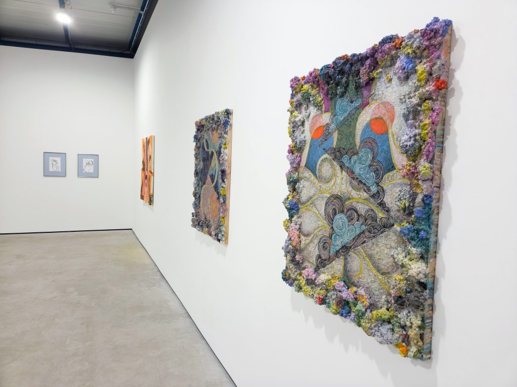
In Phillip Allen’s ‘Flat Space Thinking (more oddities version)’ (2026) and ‘Bolide Event (eye flicker version)’ (2026), thick ridges of paint crowd the edges of each board like unruly frames, while looping, shape cross central fields. The choice of mixed media and oil paint has a mysterious surface quality this avoids simple explanation. The paintings repeatedly approach coherence before stepping away from it. Densely layered curves and shapes recall organic flows like the ocean whist contrasting the encrusted edges of the composition with controlled, almost fractal brushstrokes. His group of works on paper extends these thoughts, with felt pens on large sheets of paper exploring nested Recursive marks and shapes.
Cecilia Charlton uses woven thread to explore the grid, so that geometric pattern and support become inseparable. In ‘By land or by sea (at an arm’s length)’ (2021), hand-embroidered wool reveals narrow layers across a two-metre panel between the thread and the paint and gilding base. In the expansive handwoven ‘Varnelis [the painting of weaving]’ (2025), the crossing of threads is not an image of structure but structure itself. Every thread pulls against another, so composition emerges less through control than through continuous adjustment. In the context of the exhibition, Charlton quietly proposes that painting need not depend on paint at all. The thinking of painting—its rhythms, structures and hesitations—can survive perfectly well in wool.
Fiona Rae contributes ‘Drawing (for the world, which seems to lie before us like a land of dreams)’ (2025), a gouache and watercolour work from her ongoing Word series, in which she takes a sentence from literature or popular culture and uses it as the composition’s skeleton. Rae challenges the viewer by interweaving the languages of abstraction, paint application, gesture and written text. The painting is the exhibition’s theme in miniature. Geometric forms, brushstrokes and calligraphic marks interweave between the micro and macro. Blocks of colour, read as a letter, form one moment only to be subsumed by the wider composition.
In Hayley Tompkins’ ‘Cuff IX, Snare’ (2025), a small painted shirt cuff sits beside a modestly scaled gessoed panel both painted with colourful brush marks. In ‘Collar III’ (2025), a shirt collar becomes the charged support. The garments carry the memory of bodies without identifying anyone, and paint partly erases their function while making their shapes newly conspicuous. The collar, in particular, is saturated with vivid colour and densely worked, the once-ductile fabric dried onto a stiff support, then worked and reworked with additional scumbled brush marks and passages of paint. The works are fed by feelings and lived experience that the viewer is never asked to reconstruct; instead, we find our own subject matter. Neither prop nor subject, the clothing interrupts the paintings with use, memory and the scale of the body.
Alexis Harding’s works take the exhibition’s title at its most literal: thick wet oil paint below, a thin skin of household gloss above, and a painting made from their refusal to agree. In ‘Sunder’, ‘Doubling (Poles)’ and ‘Bunching (Ultramarine)’ (all 2026), gloss is poured through a perforated length of guttering over a wet bed of oil and left to misbehave. The two materials carry different histories, one from painting’s traditions, the other from the decorating aisle. They dry at different speeds, so the surface contracts into skins that ripple, wrinkle and split like seams under strain. Harding cuts and pulls at the results, but the image is finished by chemistry, gravity and time as much as by hand. Harding builds systems designed to produce incidents. What hangs on the wall is a paused event rather than a recorded gesture, and you watch these surfaces the way you watch weather, half-expecting them to move.
Martina Geccelli shows both clay and paper. Her glazed ceramics ‘Baby Blue’ and ‘Upright Twisted’ (both 2025) begin with the vessel and then push usefulness aside: clay is built up, knocked off balance, fired, damaged and reworked, with glaze travelling over the bends and breaks rather than settling into a frontal image. Geccelli prefers growth to composition. She wants to watch where a form is going, and wants it never quite to make sense. Her work on paper, ‘Red Line with loose end III’ (2025), lets a single paper cut line wander the sheet with the same appetite for the unresolved.
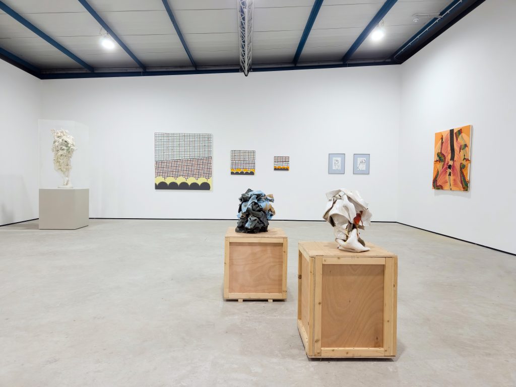
While Glenn Brown built his reputation transforming reproductions of other artists’ works, flattening the most extravagant brushstrokes into smooth painted illusions, his sculptures reverse the trick, accumulating real paint until the brushstroke becomes three-dimensional. In ‘Morbid Fancies’ (2026), a nineteenth-century marble copy of a sculpture by Antonio Canova has spent about six years in his studio being engulfed in layers of acrylic and oil, producing a second body that ornaments and smothers the first. The paint remains unvarnished, fragile, probably never fully dry in its depths. ‘Paint is only applied with a brush’, Brown comments in the catalogue, making the object, in essence, a painting. The work is compelling precisely because it never resolves. It stands in the room as sculpture and painting at once, with neither term quite able to contain it.
Tom Benson’s works are quietly thrilling. ‘Spring Raiment (3)’ (2026) and ‘Within a Spectrum of Shadow (1)’ (2025) are each built from nine narrow aluminium panels immaculately painted a single colour, arranged into a grid held slightly proud of the wall on steel pins. One arrangement is monochromatic whites and greys whilst the other is a selection of 12 non-repeating carefully mixed, individual flat colours. No single panel is the painting: the painting exists only in combination, in how the monochromes hold the wall and the space between them. For all the precision of their finish, the arrangements are improvised, settled by eye, each placement answering the last. His gelatin silver prints ‘What we see, and see (1)’ and ‘What we see, and see (3)’ (both 2023) hold the same balance in another key, photographing lengths of wire bent into freewheeling abstract lines: drawing at one remove, gesture caught mid-air and fixed as an image.
Painting speaks here in wool, clay, marble, aluminium and photographic silver as fluently as it does in oil, but the exhibition is less interested in finding a common language than in staging a conversation. Gesture, structure, sculpture and line pass from one work to another, changing meaning with each encounter. The artists rarely agree, yet their disagreements become the exhibition’s greatest strength. Rather than defining what painting is, On the Thick and Thin of Painting shows why the question remains worth asking. Sturgis buries a clue in his exhibition notes. The earliest recorded use of ‘thick and thin’ is Chaucer’s: a loose horse in ‘The Reeve’s Tale’ running ‘thurgh thikke and thurgh thenne’ through thicket and thin wood. Before the phrase promised loyalty, it described terrain, and this exhibition delivers both meanings at once: the uneven ground of painting’s histories, running from Harding’s wet swamps of oil to the ordered control of Benson’s panels, and the obsessive commitment with which nine artists keep crossing it, each by their own route, until it gives up something new. This is an excellent exhibition: generous, funny, argumentative and beautiful. Worth travelling through thick and thin to see.
On the Thick and Thin of Painting, Cross Lane Projects, Kendal, 18 July – 19 September 2026.
Andee Collard is an artist and educator based in Bolton, and co-founder of Bolton Contemporary, a non-profit organisation dedicated to making contemporary visual art inclusive and accessible to everyone.
This review is supported by Cross Lane Projects.
Published 02.08.2026 by Jazmine Linklater in Reviews
1,695 words